What is colour theory and why is it important?
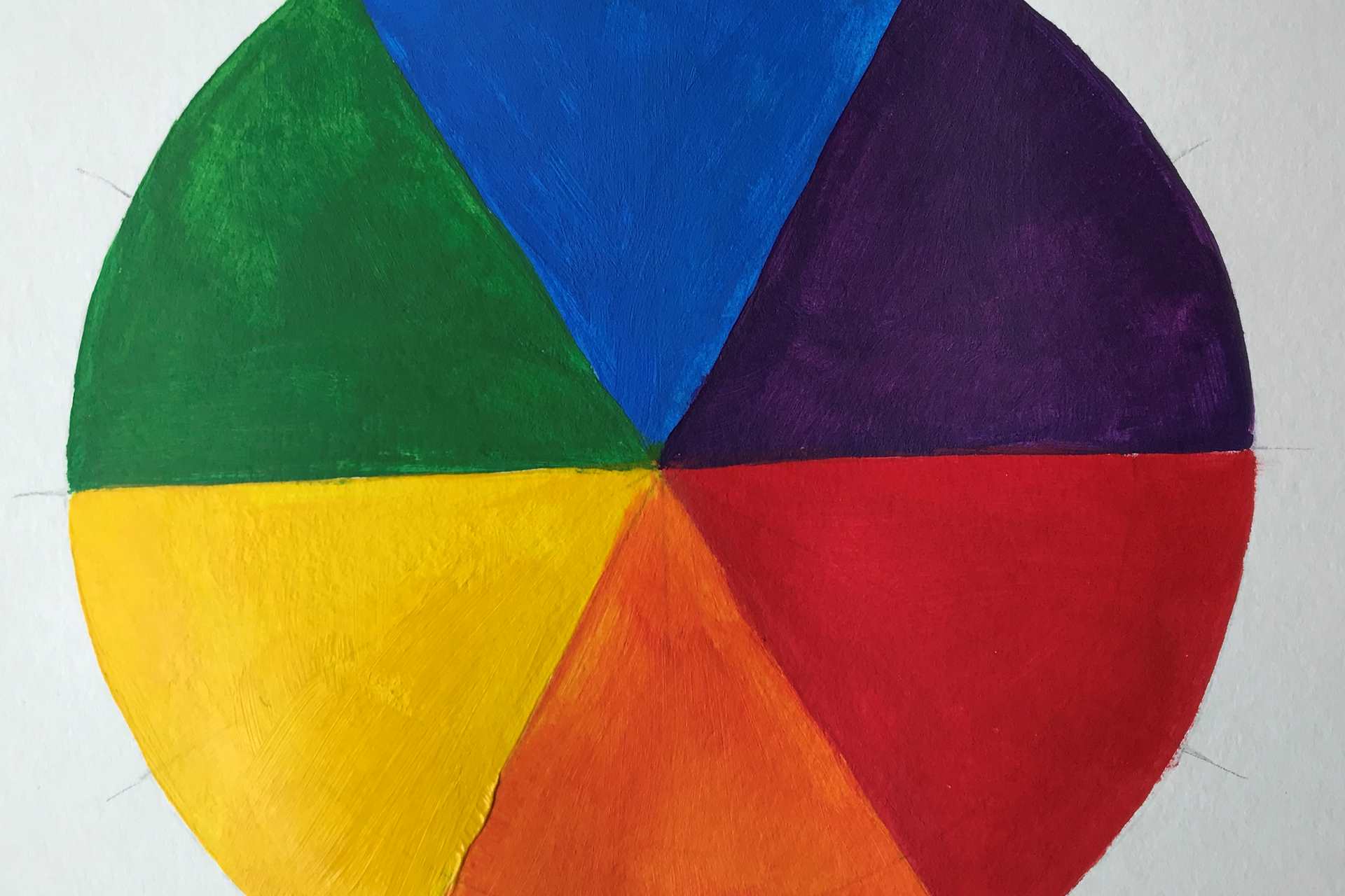
The basic colour wheel is made up of the three Primary colours Red, Blue and Yellow and the Secondary colours Purple, Orange and Green. When the Primary colours are mixed together, they make the Secondary colours. See colour wheel opposite.
Now, when you want to paint a colour wheel by mixing the colours together, it’s not quite as simple as it first appears in order to make the colours work. I remember struggling to make purple from the “red and blue” powder paint that I had when I was a child. Unbeknown to me, I was using a warm red and a cool blue and these were not going to make a lovely purple however much I tried. All I got was a muddy slightly maroon-y kind of brown, and it was extremely disappointing and frustrating!
Basic Colour Theory
I am hoping that the following information will help you to understand the basics of colour theory. It is a massive subject and there are whole books on it, so this is just a short introduction! It is generally an important part of my weekly lessons and workshops.
Warm colours are colours which are associated, at their most extreme, with warmth like the sun and fire – so mainly red, orange and yellow.
Cool colours are colours which are associated, at their most extreme, with the cold like ice and snow – so mainly blue, turquoise and violet.
Warm versions of the Primary colours:
Warm Reds: Cadmium Red, Vermillion
Warm Blues: Ultramarine Blue, Cobalt Blue
Warm Yellows: Cadmium Yellow, Indian Yellow
Cool versions of the Primary colours:
Cool Reds: Alizarin Crimson, Magenta, Carmine, Permanent Rose, Quinacridone Red or Rose
Cool Blues: Cerulean Blue, Prussian Blue, Phthalo Blue, Turquoise
Cool Yellows: Lemon Yellow
However, please note that colours do vary with different makes of paint and there are a tremendous amount of colours out there! Therefore, regard this just as a guide.
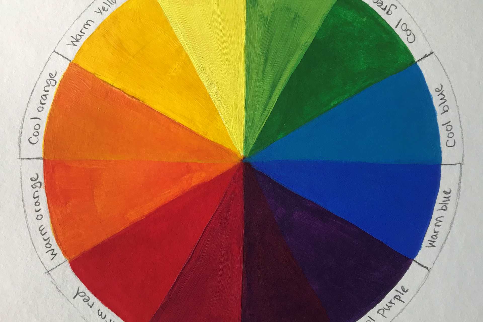
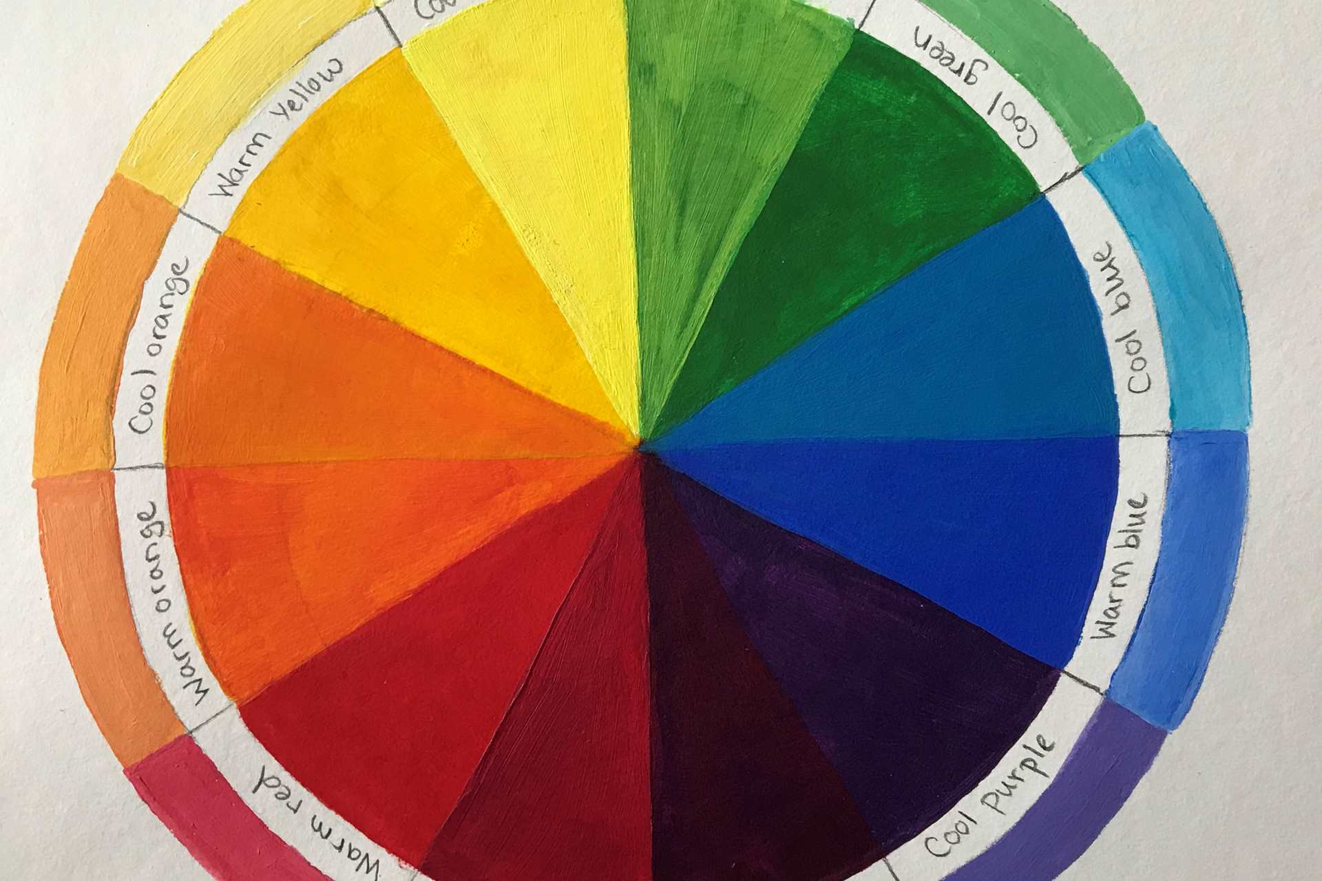
I am now going to introduce you to a colour wheel with more colour diversity (See right). As you can see we now have: an orangey yellow (Warm yellow) and a greeny yellow (Cool yellow), a yellowy green (Warm green) and bluey green (Cool green), a greeny blue (Cool blue) and a purply blue (Warm blue), then a bluey purple (Cool purple) and a reddy purple (Warm purple), then a purply red (Cool red) and an orangey red (Warm red).
So when mixing, bear in mind where the colour you are using is on the colour wheel.
For example:
Put simply, red and yellow make orange (the ultimate warm colour), but you need a warm red and a warm yellow to make the ultimate orange. Add more red to make a reddy orange and more yellow to make a yellowy orange. That is not to say that you can’t make orange out of, say, Lemon and Cadmium Red but it won’t be as bright because the Lemon has a green bias so has a very small amount of blue in it.
- If you are just starting out with Acrylics, I recommend the following colours for your palette to start with:
- A red with an orange bias for mixing orange – Cadmium Red
- A red with a violet bias for mixing violet – Magenta
- A yellow with orange bias – Cadmium Yellow
- A yellow with green bias – Lemon Yellow
- A blue with green bias – Cerulean Blue
- A blue with a purple bias – Ultramarine Blue
- Two Neutrals – Burnt Sienna and Raw Sienna
- White
White is essential, I recommend Titanium White and suggest heavy body white to my students, as it’s the lightest colour. (See below for more information about neutral colours)
Note that, with Acrylics you need to add white to make the colours lighter – this is called Tinting. However, there is some trouble shooting here: For instance, if you add white to red you will get pink. Sometimes you need to add the lighter colour situated next to it on the colour wheel to make it lighter eg, in this case, yellow. I have added the tinting to each colour around the outside of the colour wheel (see right) The best thing is to experiment and make notes. Practise really is the best thing you can do!
Hopefully these notes will help you on your way.
Complementary colours
These are the colours which are directly opposite each other on the colour wheel. They are the opposite of each other. For example, the Primary colour Yellow is opposite Purple on the colour wheel (see the first colour wheel example). To take it further, a warm yellow (with a red bias) on the colour wheel is opposite a cool purple (with a blue bias) is directly opposite. Whereas a cool yellow is opposite a warm purple (see the second colour wheel example).
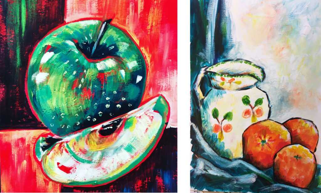
Paintings using complementary colours are eye catching, vibrant and clashing – see below. If you mix a colour 50/50 with its complementary colour you will get brown.
Analogous colours
These are colours which are next to each other on the colour wheel so for example yellowy orange, orange, reddy orange and red. These colours are all related to each other because of their close proximity to each other so are harmonious. Paintings using Analogous colours are very pleasing on the eye, as you can see here.
Neutrals
These are colours which include all the browns and greys. They are subtle and muted. Traditionally, these pigments came from natural clays etc and so named “Earth colours’. However, there are many synthetic neutrals on the market now. Classic neutrals are colours such as Burnt Sienna and Raw Sienna, Paynes Grey, Raw Umber and many more. But neutrals can be mixed using the three primary colours. If you mix equal amounts of red, yellow and blue you will make brown. The more red you add the redder the brown will be. The more yellow you add, the more yellowy brown it will be and the more blue you add the darker it will be. If the colour has a bias of blue and you use dark colours then you can make what appears to be black. Add white to this and you will get grey! If you mix the complementary colours which are opposite each other on the colour wheel eg, blue and orange you can also mix neutrals. In effect you are still mixing the three Primary colours because the secondary colour is made up of two colours – for example, red (primary colour) and green (made up of blue and yellow) .
Credit, Ali Hargreaves, Saa Professional Artist